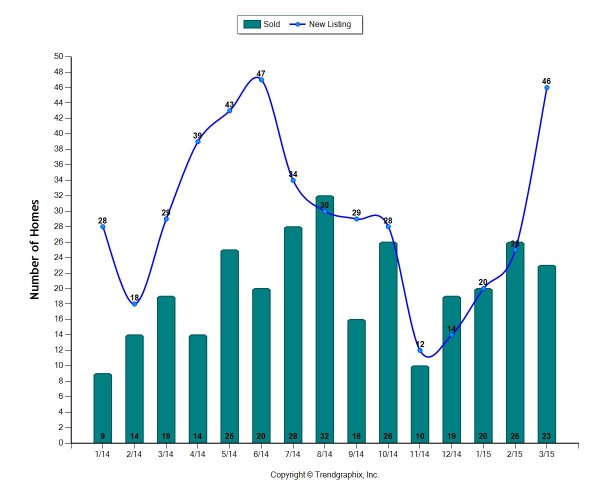
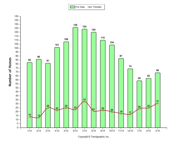
The two graphs above show trends for Lynden starting in January of 2014 until the end of March 2015. The top graph compares the number of sold units versus the number of new listings. It’s interesting to look at even just the last six months to see how the dip in new listings and how it is starting to go up but the number of solds continue to rise as well. The bottom graph is comparing the number of units for sale versus pending. The amount of homes for sale in March 2015 compared to March 2014 is crucial. This lets us know that it is currently a seller’s market. There isn’t a lot currently for sale in Lynden which is great for a seller. This allows them to often get more for their home and it will sell faster because of the low inventory.
If you have been thinking about selling your home now is the time! Let’s take advantage of the low inventory! Feel free to contact me if you have any questions.
Thanks for reading,
Danielle.