Happy New Year! I can’t believe it’s 2015 already.
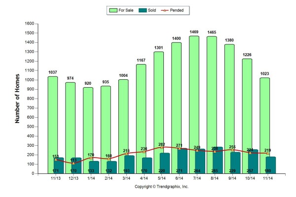
Now that 2014 is over lets take the time to look at the year in review. Here are two graphs showing stats for all of Whatcom County.
The first one indicates everything sold vs what was listed.
This second graph shows the Average Days on Market vs. the Sold/ Original List Price.
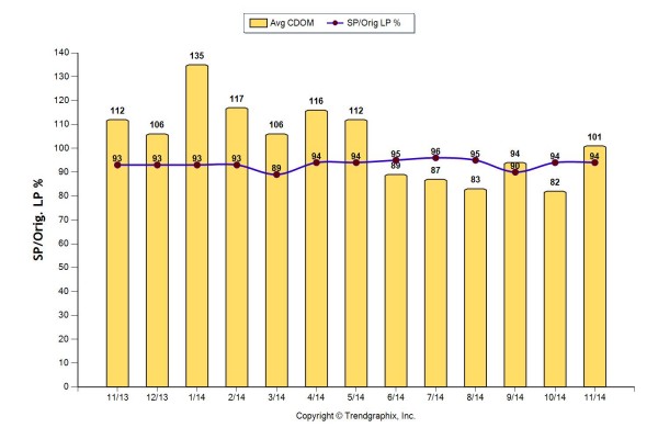
Both graphs verify that a lot more sold in the Summer and they sold quicker. Although Fall definitely was busier in 2014 compared to November of 2013. Unfortunately, these graphs don’t show December 2014 since that data hasn’t been collected yet.
I can’t wait to see what 2015 will bring us!
Thanks for reading,
Danielle